How Small Steady Actions Move Us Forward to Our Artistic Goals

Each stitch counts toward a finished dress

“Do not be afraid of moving slowly.  Be only afraid of standing still.”                                – Chinese Proverb

Have you ever thought about the importance of the small, steady actions you take every day in your artistic journey?

You can’t imagine how important these really are.

Most of us have a very distorted notion of how things actually get done in this world.  We think that great accomplishment only comes from great deeds. 

We imagine our heroes striding toward their goal in seven-league boots–writing best-selling novels in three months, building business empires overnight, soaring to stardom out of nowhere–and this gives rise to painfully unrealistic expectations of ourselves.  And yet nothing could be further from the truth.

Great deeds are made of small, steady actions, and it is these that you must learn to value and sustain.

Often you feel you’ve done nothing when you’ve actually done a lot.  That’s because what you did do seemed beneath notice–it was so small that you thought it didn’t “count.”  But it did–just as each stitch counts toward a finished dress, each brick toward a house you can live in, each mistake toward knowing how to do things right.

Directed action, no matter how small, moves toward its point.   When you change your perspective, you will start to see how small steps add up.

Posted in How to be A More Creative, Balanced Artist | Tagged , , , , , , , , | 2 Comments

Why Artists Are the Luckiest People I Know

“Petite Fleurs”- Pablo Picasso

“Picasso was drawing like an angel in the crib.”Louise Nevelson, Sculptor

A few years ago, I was at a friend’s house socializing with a few people at a little get-together. One of the people at the party was a professional psychotherapist and analyst.

I started up a conversation with the analyst and we talked for a while about our lives and what we did for a living.  It was just one of those casual party conversations, nothing really heavy-duty.

During our conversation, though, the therapist said something that has stuck with me to this day.

“You’re very lucky,” he told me.  “You know exactly what you want to do with your life.  You want to be an artist.  A lot of people don’t know what to do with their lives.  They come to me for help, for guidance. Sometimes they figure out what they want, but sometimes they don’t.  But you are different.  You know.  That’s a good thing.  You’re lucky.”

I never saw the therapist again after that night at the party.  But I have often thought about what he told me.  And I have learned through these years that he was exactly right.

A lot of people out there don’t get to be so lucky.   They don’t get to find easy answers about who they want to be in this life.  They struggle with their identity.  For whatever reason, they never really find their authentic selves.  In a very real way they remain strangers to themselves, lost souls.  And I think that’s kind of sad.

Why You Are So Lucky….

But if you are anything like most artists I know (and I’ll bet you are), you have always known that you were a creative type.  You have always been drawn to create, to write, to paint, to sculpt.  You have probably always known that since you were very young.

You were probably drawing or painting (or whatever it was that you did) just like Picasso in the crib.

Posted in Lessons I Learned in the Dark | Tagged , , , , , , | 4 Comments

Best Tips for Choosing and Using Color in Your Home (Part 2)

Want to liven up a dull room with color but not sure where to start? Use these helpful tips to learn how to choose and use color to add interest to any room.

This post is Part 2 in a series of 3 blog posts. Please check out the first blog in this series 10 Best Tips for Choosing and Using Color in Your Home for more ways to find and use color.

#11. Rule of Three

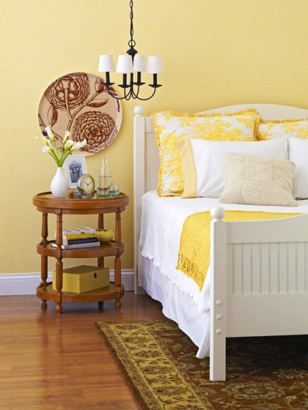
Follow the rule of three: When you pick a color, use it at least three times in a room.

Here, yellow appears in the pillows, on the blanket on the bed, and as an accent color on the nightstand, as well as on the walls.

#12. Keep Hallways Neutral

Think of hallways as palate cleansers — the sorbet that’s served before diving into the next course. Keeping them neutral allows you to branch into any color in rooms that flow off them.

#13. Make Accents Pop

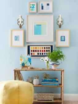
As a building block for a color palette, look closely at art and fabric. Pull out the background colors for room accents.

#14. Furniture Various

Break up a room of matchy-matchy wood furniture with one painted piece. It doesn’t have to be a bold color. Combine natural wood tones with black.

#15. Mix Textures

Use various shades of a single color to pull a room together. Add different textures such as suede and silk to prevent monotony.

#16. Warm Up White

White brightens whatever it’s with, but it can also be harsh. Try off-white instead. When you put a warm white next to a color, it will still look bright and crisp.

#17. Freshen Up

Fresh flowers are a perfect way to add color to any room without a long-term commitment. They also help celebrate the season.

#18. Accessorize with Color

Everyone thinks of walls when they think of color.

But using color in accessories–art, pillows, rugs–makes an amazing impression without going crazy on the walls.

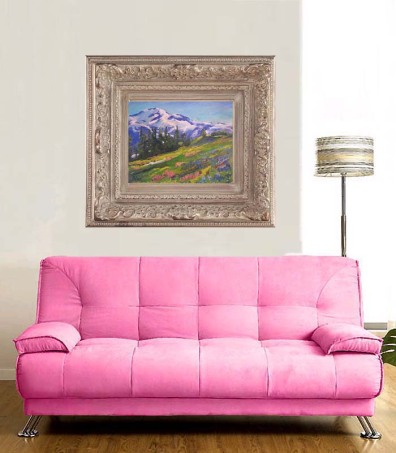
The giclee print on the right uses soft pinks in flowered fields that match the more robust pink in the couch.  It also brings balance to the setting by adding blues and complementary greens.

The print is titled, “Mt Rainier National Park” and is available for purchase in my Giclee Print Gallery. Click here to view a larger image and purchase.

#19. Include a Neutral Color

Neutral colors act as peacemakers — they help bold colors and patterns get along.

#20. Light a Room with Style

Add a colored or patterned shade to a lamp to liven up a room. It’s a quick change that makes a big impact.

Posted in The Artful Home | Tagged , , , , , , , , | 4 Comments

Going Through: Surviving the Swamplands of the Artistic Journey

“Truth is always on the side of the more difficult.” – Friedrich Nietzche

Not too far from the small town where I grew up in northwest Louisiana, there is a long stretch of swamplands called, graphically enough, “Black Lake Swamp.”

There is a paved highway with bridges that runs right through the heart of the vast wetlands.   And if you ever saw the movie Steel Magnolias and remember the scene where Sally Fields takes a long drive at sunset after her daughter’s (Julia Roberts) death, then you’ve seen this exact place.

It is interesting to drive through such muck on a paved road, but no one I know would like to live there.

Re-Imagining Ourselves

The artistic journey is a labyrinth that leads only into a conundrum at best. There are no comforting explanations. The way is often unclear.

And the point is that we have no choice but to be pulled into these swamplands, and repeatedly.  We would like to believe that if we live with high moral purpose we will be exempt.  But remember Job and the message of Ecclesiastes.  There is no moral contract which we are able to strike with the universe.

The great rhythms of nature, of time and tide, of fate and destiny, and our own psyche, move their powerful ways quite outside our will.

And while it might be terrible to have to wade alone into the quagmire, that is where we as artists might find ourselves often, so it is no time to try to scamper back, or freeze mid-transit. We are out there in the muck whether we wish it or not.  We were put there.  As Pascal wrote, “It is not a matter of deciding whether or not to set sail; we are already launched.”

So we are forced into a difficult choice. If we move forward and out into the creative world toward the “side of the more difficult,” as our soul insists, we will be flooded with anxiety.  If we do not move forward, we will suffer the depression, the pressing down of the soul’s purpose. Hardly a pretty choice. But it is a choice that each artist makes, consciously or not, virtually every moment.

In such a difficult choice, we must choose anxiety, for anxiety at least is a path of potential growth; depression is a stagnation and defeat of life.

Going Through

There is an incredible sweetness that comes to those who have “gone through,” though you could not begin to imagine such a thing while enduring the torments of Hell.

Thomas Yeats, aging and in poor health, surveys the turbulent course of his artistic life and in 1929 concludes:

We must laugh and we must sing,
We are blest by everything,
Everything we look upon is blest.

The above lines are from “A Dialogue of Self and Soul,” in Selected Poems and Two Plays. They come at the end of a long text which acknowledges the defeats, disappointments and losses of Yeats’s life.

No shallow optimism there, only the deepened wisdom of a person who spent much of his life in the swamplands, and from that material forged his life and art.

Like us all, Yeats would have preferred certainties but found only fragments, disappointments, but most of all the need to find his own truth.

Like us all, he would have preferred to be given the big picture clearly, coherently and quickly.  Like us all, he had to painfully piece things together over decades.

The Blur and Blot of the Artistic Journey

We never achieve final certainty, never see the whole picture, never arrive at the sun-lit meadow.  We see through the glass darkly, see bits and pieces only.

And so for all of its transcendent mystery and beauty, the life of an artist is also a blur and a blot.

We never see it clearly. We never get it right; we never get it fixed; we never get it finished. Only now and then are there moments of purpose, of clarity, of meaning.  For surely we are not gods.

Posted in Lessons I Learned in the Dark | Tagged , , , , | 2 Comments

Are You Becoming Your Own WordPress and Internet Marketing Expert?

Are you becoming your own internet marketing expert?  Are you researching and learning everything you can about how to grow your WordPress blog?

Last night I attended a WordPress Meetup group in Brooklyn.  There was about 50 people in attendance and the conversations and lectures were very informative.  There were lots of internet and WordPress designers and developers eager to share what they knew.  And there was some very delicious NYC pizza.  Who could ask for more?

I will certainly be going back to this group which meets every 3rd Tuesday of the month.

So this is what I am doing to grow my understanding of marketing on the internet.

But the big question I have for you is:  What are you doing?

Are you becoming your own expert?  You should.  Your competitors probably are.

My suggestion is to read everything you can in the library and the bookstore.

Find some experts and pick their brains.  They will talk to you all day because they love to talk about the internet.

Let me know in the comments what you are doing.

Posted in Art Business Success | Tagged | 2 Comments

8 Oil Painting Techniques for the Inquiring Artist

Have you been wanting to bring something new and edgy into your oil painting?

Have you thought about trying a new technique or approach to applying the paint?

Here are some ideas that are sure to breathe new life into your oil painting technique toolbox.

1. Wet into wet

Wet into wet is the process of adding fresh color into existing, still wet layers. The technique can be used to bring great immediacy and interest to the image.

It also can be used as a technique for blending, and can be accomplished with the color in virtually any state of viscosity, from thick and stiff, to fluid.

2. Glazing

Glazing is accomplished by building up of layers of transparent or semi-transparent colors over dry underlayers.

The effect is one of great depth and spatial atmosphere. It is a lengthy technique, but the effects in oil are unmatched when compared to other media. Stand Oil is perfectly suited for building layers of brilliant, glazed color.

Impasto technique showing layers of thickly applied paint

3. Impasto

Impasto is the technique of applying stiff, thick color, leaving brush and knife marks as a central element in the painting.

Jackson Pollock used this method often. He would squeeze the paint directly from the tube onto his canvas as if he were drawing with a large crayon.

An impasto surface can be dynamic and powerful.

For thick impasto, build the texture in several layers, allowing each to dry before applying the next.

4. S’graffito

S’graffito is the technique of scraping into a wet oil film, usually with the handle end of a brush, or a painting knife. It’s an expressive effect, and is also effective for defining outlines.

5. Scumbling

With a stiff brush, work a thin film of opaque or semi-opaque color loosely over your painting, allowing color from the layer below to show through. The effect is highly atmospheric.

6. Oiling out

Oiling out is the application of oil medium to a painting that has sunk, or lost oil to the layer below.

Linseed or Stand Oil should be sparingly rubbed into any sunken area with a soft cloth. Wipe off any residue, and leave the painting to dry for a day or two. If smaller dull areas remain, repeat the process until the painting has regained an even sheen.

The most common cause for sinking is the use of a ground which is too absorbent, and often occurs if a household primer is used. Sinking can also result if the color has been over-thinned with solvent.

7. Murals

With appropriate preparation, oil colors can be an excellent choice for murals.

Unless the wall is new, the surface should be stripped back to plaster and must not be “friable” (dusty or broken) or damp. If new, the plaster should be sized and then primed with Acrylic Gesso Primer or Oil Painting Primer.

The finished work should be allowed to dry for a suitable period (at least six months for traditional oils, and then protected with a removable picture varnish (if indoors).

8. Monoprinting

Artists’ Oilbar has proven to be particularly popular with
printmakers for monoprinting. Oilbar can be used directly on a glass plate, with or without medium, for direct transfer to the paper.

Let us know in the comments below of any other techniques or applications that you have tried that are not listed here.

Posted in How to Paint in Oils | Tagged , , , , , , | 2 Comments

Mastering Glazing Techniques in Watercolor: Understanding Pigments

Are you a watercolor artist looking to improve your technique?  Would you like to better understand watercolor pigments and glazing methods?

Then you will certainly enjoy this guest blog by watercolor expert Dr. Don Rankin.  He is author of Mastering Glazing Techniques in Watercolor Volume 1: How to Make Your Paintings Glow.

Don is currently a full-time Assistant Professor of Art in the School of the Arts, at Samford University in Birmingham, Alabama.  He teaches color theory, structure of design, painting and drawing.

Don has an earned Ph.D. in Visual Communication with a specialty in American Indian imagery. He is a former President and one of the co-founders of the Southern Watercolor Society.

His work has been featured in American Artist magazine, The New York Art Review and Northlight magazine as well as other regional and national publications.

Mastering Glazing Techniques in Watercolor:  Understanding Pigments by Dr. Don Rankin

Dr. Don Rankin, Fine Artist

I am currently new to this form of communication. In fact, I have to run to try to keep up with my younger students when it comes to electronic media.

Hopefully I am learning. I am currently working on Volume II of “Mastering Glazing Techniques in Watercolor”. Volume I was revised, updated and re-issued in November, 2011. It is available at some retail outlets and Amazon.com or go to don.rankin1@Facebook.com.

While working on the new book I am playing with Quinacridone colors. Now these colors are not new by any means. In fact the were first developed back in the 1890’s. At some point in the 1950’s they became popular in the automotive industry. From there they eventually made their way to our palettes.

Some painters have trouble pronouncing the name (KWIN-AKRI- DAWN). These colors provide a boost to those who are interested in watercolor glazing techniques primarily because they are so transparent. For some of us dinosaurs this can be a bit disconcerting at times but that is another story.

Watercolor technique is a living thing provided we painters continue to experiment.

The object of this post is to encourage experimentation. You don’t have to go over board but it helps if you stay current with new possibilities.

There are a number of pigment guides that suggest this paint over that paint. I’m not interested in adding to the fray. I suggest you become a label reader. Look for the chemical names or designations such as PV19 or PR179. Google the designations and read if you want to know more about certain pigments.

Color Test for Transparency

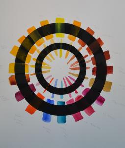
Color testing for transparency using rings of black india ink.

In this short piece I am providing a chart. The black rings are painted with black india ink.  It is waterproof and provides a uniform dark area for this test.

The upper ring has the paint applied in a full bodied wash, straight from the tube. The smaller ring has thinner strokes of color that have been diluted to about 50% of the first wash.

I am testing for transparency. If the color seems to disappear as it passes over the black then it is pretty transparent. If it appears cloudy, then not so transparent.

I have chosen a group of colors that are currently available and many of these are in regular use in my studio. I’ll start naming the colors from the top and work clockwise.

Personally, I consider all of these colors to be of professional quality. In the past I used to caution students about paint tubes with names like “periwinkle pink” or “green apple”. These sorts of names usually indicated a less than desirable product. Well, that has changed, at least for one brand, American Journey. I have tested and used the colors and you will see several listed on this wheel.

From the top: Winsor & Newton Lemon Yellow, American Journey Indian Yellow, American Journey Quinacridone Gold, American Journey Old Sienna, American Journey Copper Kettle, American Journey Lucky Penny, American Journey Oxide Yellow, Winsor & Newton Quinacridone Magenta, American Journey Pomegranate, Winsor & Newton Permanent Rose, Holbein Marine Blue, Maimeri Blue, Holbein Brilliant Orange, Winsor & Newton Purple Madder, Winsor & Newton Quinacridone Gold, Sennelier Indian Yellow, Grumbacher Indian Yellow, Stephen Quiller Gamboge, M.Graham Gamboge, & Winsor & Newton New Gamboge.

You may ask why so many yellows? Yellows are often the most opaque in nature. This sampling allows a glimpse at the relative nature of several brands. This is not intended to judge one color over another. Rather this is a glimpse at the behavior of individual brands. If you investigate you will see that there are some colors of different brands that show a bit of difference in appearance.

I am currently working on other charts that will show characteristics of reds, etc. This is a work in progress. Hopefully this will help spur you to test your own colors. Don’t worry too much about “scientific” approach. Pick up your brush and paint. The manner in which you apply your color is the best guide for YOU.

This article and all images were reprinted and used by permission from Don Rankin.
Posted in Guest Blogs | Tagged , , , , , , , , | Leave a comment

The Harsh Truth Why Your Art Blog or Website Isn’t Growing (And What To Do About It!)

Are you trying to grow your art blog or website? Are you finding that you are not getting many subscribers or much traffic?

You may find that you are getting some comments.

And maybe a few subscribers, and shares, and likes.

But if you’re reading this, chances are you’re running a blog with the intention of marketing a business and making some money.

Now, that could be a bit distressing, because most bloggers are broke.

Here’s why …

It’s all about you

This is the big one.

Unless you are a famous movie star like Brad Pitt or Angelina Jolie, nobody cares about you personally.  So wake up and smell the coffee, because it ain’t about you baby.

Yes, that’s right — all of your posts are about you, your news, your newest paintings or photographs, your studio. And you wonder why nobody signs up for more?

This is where I see so many artists making their biggest mistake.  I even saw a website recently of a art business guru (I am obviously not going to mention the expert’s name)  who was telling her artist followers to blog constantly about their art and their newest art offerings.  This is terrible advice.

No One Wants to be Sold, They Want to be Helped

Stop and think about this for a moment. Why did you click this link and decide to read this article?  Why are you here?  It’s obvious isn’t it? You wanted to get some help growing your art career.  You wanted some tips. You wanted a problem solved. You wanted to learn something that would benefit you.

That is what the internet is all about. Another name for the internet is the Information Super Highway.  It’s a resource that helps you to learn and grow in many ways.

Now stop and think about this. If the title of this article had been “Come Look at My Newest Painting That I Just Finished” or “Museum Quality Art Prints by Gary Bolyer for Only $300”, would you have even bothered to click the link? Probably not.  Would you have come to my website or blog?  Of course not.  Why? Because clicking on those two links would not have helped you in any way.

Let’s look at it this way for a minute. Suppose your favorite TV show is CSI New York (This really is my favorite TV show, lol), which comes on CBS on Friday nights.  Now let’s suppose that you tune in one Friday night and there are only commercials for the entire hour. There’s not even one minute of the show, there’s only one commercial after the next.  Would you keep watching for very long? Of course not. You would think that there was some kind of technical difficulty with the local station or the network and you would have just turned it off.

Why You Must Learn About Content Marketing

Your blog is just like a TV show or a educational center for a niche market. 

You must offer some entertainment or education that speaks to a specific group or niche.  This is called content marketing.  You can’t just have all commercials about your products, because nobody will tune in for just commercials. Are you starting to see the big picture now?

But you do have to make some commercial pitches to have a business. Everyone understands that.

So what is a good balance between content and commercial pitches?

Follow the 80/20 Rule

A good rule of thumb is to have around 80 to 90% of your blog posts to be about viable content that is very interesting or entertaining to your readers.  The remaining 10 to 20% can be blogs or commercial pitches about your newest paintings, your studio, or you in general.

I sometimes like to incorporate small bits and pieces of my biography into the content blogs.  So my readers are being helped and learning about me at the same time.  I do this a lot and if you do it well, it helps everyone.

So forget about yourself for a while and think about your customers, your collectors. What are their problems? What matters to them? That’s what you need to be writing about most of the time.

Figure Out Which Group(s) Are You Going to Help

Before you write your next blog or article, I want you to do one thing.  I want you to think about which groups of people you want to help and how you want to help them with your art knowledge.

Let me tell you what I’m doing and which groups I am helping so you can understand this concept better.  You can copy what I’m doing if you like. I’m not afraid of you becoming my competitor because the internet is so large.  There’s more than enough out there for everyone to do well.

If you look on the top right hand column of this blog where it says, “I’m writing about…”, you will see my blog categories.  There are 10 categories, but the main ones are:  1) Art Business Success 2) How to Paint in Oils and 3) The Artful Home.

1) Art Business Success Category

This series of blogs helps artists understand the business side of their art careers.  It brings in traffic from artists who are looking to make their art commercial.

2) How to Paint in Oils Category

This series of blogs helps serious oil painters understand oil painting better.  I use my years of oil painting experience and have a lot of fun writing these posts.  Oil painting is what I love to do and I also love to write about it as well.

If you paint in watercolors or acrylics, just let your love of your craft show you the way. Write from your heart and you will do just fine.  You will be helping others and yourself as well.

3) The Artful Home Category

This is a new category that I have just added.  This series of blogs is focused on helping and teaching housewives how to make their home more beautiful, interesting, and cozy using art and color design theories.

These are the categories that I have decided to focus on right now, but there are many more.  I haven’t even scratched the surface here. Think about the art collectors and art lovers who are not artists. What could you write that would help them to learn more?

But Don’t Go Overboard and Forget About the Commercials

You’re here to build a business right?  So you have to learn to ask your readers for the sale. Build a gallery of your best paintings, prints, or whatever you sell and put a shopping cart in as well. Make it easy for your readers to buy from you.

Occasionally write blogs or articles about your newest offerings.  Add a link that takes them to the gallery with the shopping cart.  Ask them to buy now, be very direct.

Now, a question: how long are you willing to wait before your blog starts delivering dollars to your bank account?

Having realistic expectations is important. If you try to run a marathon as though it were a sprint, you’ll end up exhausted on the side of the road. And if you try to run a sprint as though it were a marathon, you’ll finish dead last.

So what kind of race do you want your blog to be running?

If you’re willing for it to take 2-3 years to get your blog to where you want it to be, then a good strategy is to read business books for bloggers, along with the best blogs in the industry.

If you want to get there a little faster, subscribe to my blog today. It’s free to subscribe and I will never share your email address with anyone.

So that brings us to the end of the content marketing article. But before you go, why not take a look at one of my art prints. I’m very proud of this one. It is titled, “Mount Rainier National Park”.   It is a museum quality giclee print. And I will send it out right away to you with a free signed certificate of authenticity.  Click here to look at my art print gallery now!

Posted in Art Business Success | Tagged , , , , , , , | 17 Comments

10 Best Tips for Choosing and Using Color in Your Home

Want to liven up a dull room with color but not sure where to start? Use these helpful tips to learn how to choose and use color to add interest to any room.

Color creates moods — think of a serene aqua bathroom, a cheery yellow breakfast nook, or a kid’s room done in energetic primary hues.

Optimistic colors are guaranteed to brighten your mood!

#1. Test Paint Colors

Always remember to test out paint colors before diving in headfirst. Paint large sample swatches by the window, next to trim, in the darkest corner, in the lightest corner. Let them dry, and give them a second coat so you can accurately assess the color.

#2. Experiment with Hues

With a few chips you love in hand, make your way to less-saturated chips. You’ll likely find that a muted version — one that looks almost too muted on a chip — will work best.

#3. Get Inspired

Take the time to curate your color palette. Collect magazine pages, brochures, post cards — anything with a color combination that intrigues you. Gather home-related items that catch your eye, such as fabric and wallpaper swatches, flooring samples, and paint chips, or even non-home items, such as natural finds. Take snapshots of things that inspire you. Edit and add to your inspiration board as you work through the decorating process.

#4. Set the Mood

Decide what mood you want the room to embody. Different colors, tones, and saturations will naturally lend themselves to a certain persona. For example, if green is your hue of choice, a soft sage will project serenity and calm, while a seafoam shade will give the room a relaxed, cottage feel. A dark olive green will imbue a classic, reserved look; conversely, a zingy apple green will project trendy vibrancy.

#5. Neutrals: Mix It Up

Neutrals get more exciting when you mix textures and materials. Contrast adds spice to a potentially boring color palette.

#6. Gather Inspiration

Many people look to their closets for inspiration, but here’s a better idea: Raid your accessories.

Your handbags, belts, and jewelry are bound to contain more colors that excite you.

#7. Lighten Up

To translate a feel-good color into one that looks good on the wall, ask at the paint store about the color’s light reflectance value (LRV). “The higher the LRV, the more light will bounce around the room. The lower the LRV, the more the color will absorb light, which will make the room seem moody.

#8. Myth Busting

People are nervous to put dark colors in small rooms. But they don’t make the room seem smaller, they just make them darker. Use mercury glass and mirrored lamps to make the room less cavelike.

#9. Spread Color

When you’re spreading color around a room, think about proportion. If you’re using three colors, try a 70/20/10 distribution: Use the lightest color for 70 percent of the room’s decor, the second lightest for 20 percent, and the boldest for 10 percent. For two colors, go with 70/30.

#10. Look Beyond Chips

Pick colors using objects as your guide — an old celadon teapot, the burnt sienna in a paisley fabric, a blade of grass. It’s so much more lively than paint chips. I always, always, always start with a thing.

There are many ways to bring vibrant color into your home.

Dynamic works of art stir the emotions and lift the soul.  Take a look at my giclee art prints. Click here now to see.

Posted in The Artful Home | Tagged , , , , , , | Leave a comment

What Can an Artist Learn from Watching the Evolution of My Blog?

“Do not be afraid of moving slowly. Be only afraid of standing still.”  – Chinese Proverb

Have you been thinking about starting a blog or website to showcase your art, but have been holding off for financial or technical reasons?

I understand.  I did the same thing for a long time.

Getting a professional web design service can cost around $5,000.  Most artists who are just starting out don’t have that kind of money.   And the technical aspects of starting and maintaining a website can be overwhelming at times as well.

So I think a lot of artists out there are floundering with getting started on the internet.  If you are one of those people, just hold onto your hats because help is on the way.  All you have to do is emulate exactly what I’m going to tell you here about how I started this blog and what my plans are for it, and you can duplicate it and have your own free site just like I have done.

My Blogging Story

I started this blog on WordPress.com on July 1, 2011.  I really didn’t know much about blogging and I didn’t have a website.

I have always enjoyed and been pretty good at writing, but I’m really a visual artist and not a writer. I was (and still am) a landscape painter living in New York City.   I started with WordPress.com because I had been told by some very reliable experts that it was the best of the free blogging services.

So I jumped right into a WordPress blog not really knowing what I was doing.  At this writing almost a year later, I have posted 106 blogs in 11 categories.  I have been featured several times on the front page of Freshly Pressed, which is a big blogging honor.

I have 337 followers from all over the world.  Most of those (around 99%) who have signed up are still with me and still read my blog today.  If you are one of those who signed up last July, you may still remember my first blogs.

The Evolution is Just Beginning

So it’s been quite a blogging journey for me.  But really, it’s just beginning.  Why?

Because the next phase is going to be the most interesting in the evolution of this blog.  My plan is to go from being hosted by WordPress under their domain to creating my own domain with a paid hosting service.

There are many advantages and reasons for this.  Having your own domain name with a paid hosting service is the only real estate you can own on the internet.  As you build your brand on the internet, it will become very, very valuable real estate.

Having your own domain name and hosted site also gives you the most flexibility.  There is no other management agenda controlling what you can or cannot do.  It is totally yours, and you are free to add what content you like without restrictions.

Also, the search engines will rank you higher if you have your own domain name.  Search engine ranking and optimization is important for growing your brand.

And lastly, you can design your blog or site using whatever design resources you wish.  You can polish and give your site a much more professional look and feel.  This is the most important key to website success.

So Follow Me Along, I Think It’s Going to be a Lot of Fun

By the end of the summer, I plan to revamp this free WordPress blog into a much more polished and professional site. And so it will have a lot more to offer you.

I will let you know in future blogs exactly how I will do this. So even if you are not very technically oriented, you will still be able to follow along and create one for yourself if you like. It’s really much easier than you think.

If you haven’t started a blog for yourself, there’s no reason holding you back now.  With WordPress.com, it’s free and simple and you can grow it as big as you like.

Truly, the best is yet to come.

If you have a story about how you started with a free WordPress site and took it to the next level, please let us know and share your link in the comments below.

Posted in Art Business Success | Tagged , , , , , , , | 8 Comments